Time Present and Time Past
Essay on Susanne Kamps' Paintings by UK Art Critic Anna McNay, 2020
Time Present and Time Past: the uniting of temporal planes in the work of Susanne Kamps
ANNA MCNAY*
Time present and time past
Are both perhaps present in time future,
And time future contained in time past.
[TS Eliot, Four Quartets]
‘Who would not, while looking at the painting of Susanne Kamps, think of Matisse, Dufy, Derain and the Fauves…?’ asks Christiane Dressler in her 2010 essay on Susanne Kamps' work.(1)
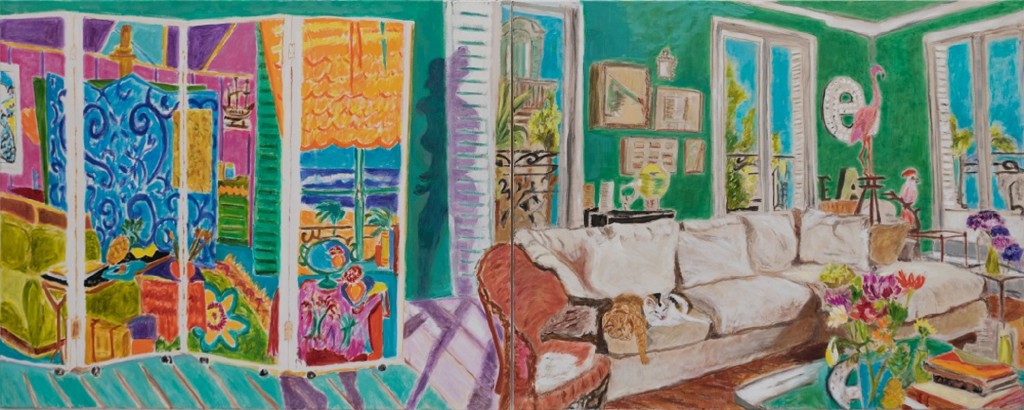
Certainly this is the case with the four works submitted to the tenth anniversary of Cynthia Corbett’s Young Masters Art Prize last year, in particular the diptych Behind the Screen (2019), which specifically pays homage to Henri Matisse’s Interior with Aubergines (1911).

The vivid colour palette, the fronds of palms, the shuttered windows and tilted perspective all nod indisputably in the direction of the artist whom Kamps admits to having taken as her greatest inspiration since the year 2000. However, it would be far too facile to look only to him, as Kamps’ knowledge of and sampling from art history goes much further, taking in not only specific artists, but also movements, motifs and devices – all of which she subjects to her own interpretation, rendering the finished works, as she terms them, ‘homages’, very much imbued with her own added flavour. Kamps neither copies nor steals (to reference the widely-attributed Picasso quote that ‘good artists copy, but great artists steal’): she absorbs, amalgamates and reinterprets, using the art of past masters much as she uses her collection of photographs, bric-à-brac from her beloved flea markets, and domestic objects – as, in the words of Matisse, a ‘working library.’(2) For me, the artists who come to mind most when looking at her paintings are Pierre Bonnard and Edouard Vuillard, known for their style of ‘intimism’, or use of the domestic interior, along with the juxtaposition of pattern, planes of flat colour, and, again, the window motif. But there is also Kamps’ use of the diptych, which compositionally opens up the concept of past and present, as much as the looking back to art history for inspiration does on an academic level.
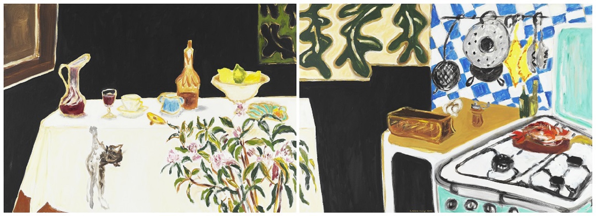
Take the diptych Comme Chez Nous (2017), for example. The right-hand canvas depicts a domestic kitchen scene with an old-fashioned stove, colander, sieve, pepper grinder, bulb of garlic… The two canvases both do and don’t join seamlessly – the white-clothed table that fills the majority of the left-hand canvas runs over on to the right-hand one, as does the flowering oleander plant standing in front of it. But the upper section seems dissonant – the two sets of Matissian cut-out leaves abut abruptly. It is unclear whether they are intended to be pictures on the wall or windows – knowing the answer is not, of course, a prerequisite – but this slight jarring of the viewer’s reading across the work makes clear that there are two distinct planes at play. Whether these are planes of space, of time, of imagination and memory… Again, anything is possible.
A similar effect is evoked in Kamps’ earlier painting Chambre Bizarre (2008), which comprises a peculiar diptych-esque division, with the left-hand canvas making up two thirds of the composition and depicting an interior with a table, and, in the background, a window opening out on to a scene with a bridge and palm trees, plus what could be a seaside promenade, with the blue-patterned wallpaper curling in from this secondary image, as if it were the lapping waves splashing into the room. The right-hand third, almost entirely unrelated, depicts a display of lilies – quite Japanese in its decorativeness. One wonders whether the ‘bizarre’ of the title refers to the room itself or to this anomalous division of space and introduction of a new, non-linear plane.
Japonisme – and the ukiyo-e printmakers of Edo period Japan – is a style which has influenced Kamps both directly, but also through the artists she draws from most readily. A phenomenon which reached the peak of its influence in the west around 1890, it readily employed the polyptych form, as well as the use of black in its woodcut technique – another aspect reflected in Comme Chez Nous (and seen in Matisse’s work, in, for example, Still Life with Pomegranates, 1947).(3)
The table in Comme Chez Nous, based on Henri Fantin-Latour’s Still Life Corner of a Table (1873), comprises a random assortment of items, as Belinda Thomson writes of Vuillard’s The Candlestick (c1900): ‘[a] seemingly haphazard conjunction of disparate objects – a far cry from the selective monumentality of the still lifes of Paul Cézanne…’(4) Whereas Fantin-Latour was best known for his flower paintings, Vuillard’s art was ‘a celebration of the mundane’, ‘succinct intimacy.’(5) Unlike the claustrophobia often felt in his heavily patterned and dark interiors, however, the tone and feeling of Kamps’ works is the exact opposite. Even Comme Chez Nous, with its dark background, is, perhaps due to the foregrounded white and turquoise, bright, light-filled, airy, and has, as the title suggests, a sense of homeliness.
Nevertheless, there is a certain tension. The stove depicts the one in Kamps’ atelier and, albeit unbeknownst to the viewer, adds a twinge, relating to her not knowing, from day to day, whether or not it will fire. More overtly, the leaping cat not only adds movement but causes a sharp intake of breath on the part of the viewer. The picture captures a precise moment in time – the very instant of the present, now already past, but immortalised forever in the window of the canvas – and one is bound to wonder: what will (or did) happen? Will (or did) the cat bring the tablecloth crashing down, smashing the decanter, glass, fruit bowl, dish and other tableware?
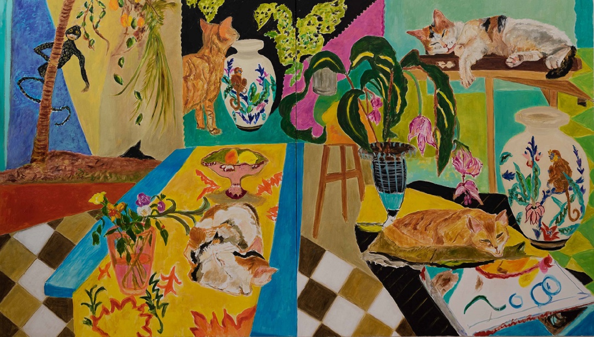
Cats are hugely significant, not just in Kamps’ work, but also in her life. ‘I am indeed a cat person,’ she admits. ‘We have two lovely cats, Seraphine (tricolour) and Carry (a very modern cat, and she is very smart as well – she manages to open the fridge by herself). Of course, they are the coolest cats in the world.’(6) These cats appear frequently in Kamps’ works, as, indeed, they do – albeit often camouflaged – in Bonnard’s. Cat Days (2017) – a homage to David Hockney and his Dog Days, a book of paintings and drawings celebrating the companionship of his dachshunds Stanley and Boodgie – is, similarly, entirely dedicated to Kamps’ domestic companions. The repetition of the cats across the two canvases came about purely because Kamps felt that Seraphine was so big she had to paint her more than once – sometimes her compositional decisions really can be this seemingly arbitrary. The large 1930s vases with monkeys on them, for example, were eBay purchases – ‘I saw them and knew I had to have them!’ – in themselves not too frightfully expensive, but, once shipping from the UK was added on, ‘they ended up being the most expensive vases ever!’ Accordingly, Kamps felt she at least had to immortalise them in a painting.
As Chris Stephens describes the components in the paintings of Vuillard, so are those in Cat Days ‘representational but design-oriented’.(7) To let Vuillard speak for himself: ‘One lives surrounded by decorated objects. In the most ordinary interior, there’s not an object the form of which doesn’t have an ornamental pretension – and most of the time the form hides its function from us under these irrelevant embellishments’.(8) Certainly, Cat Days epitomises what Thomson describes as Vuillard’s ‘modest objects and dense patterns’.(9) She goes on to describe how the French artist, with his cleverly chosen assemblage of patches of flat colour and pattern, remained true to the artist and writer Maurice Denis’ dictum, from his Définition du néo-traditionnisme (1890), whereby the ‘flat surface [is] covered with colours arranged in a certain order’ but tells a homely narrative too.(10) The same holds true of Kamps’ paintings, just as she also has a habit of seemingly throwing together a composition of objects, patterns and colours she loves, ‘in defiance of would-be objective rules of taste,’(11) nevertheless creating runaway poetic successes, as only an artist blessed with good taste might.
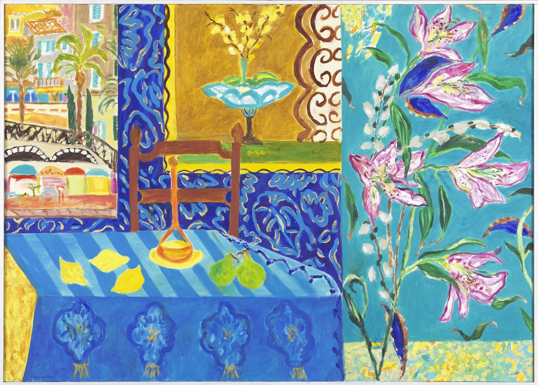
Kamps’ colours are intense and vibrant – like those of Matisse and the Fauves. She often mixes fresh pigment into the wet paint on the canvas, in order to achieve the greatest degree of colour saturation possible. Bonnard, too, adopted this brilliant palette following his visit to Saint-Tropez in 1909, when he was awed by the Mediterranean colours, ‘the sea, the yellow walls, the shadows as coloured as the light’.(12) Years later, his works – take, for example, The Gulf of Saint-Tropez (c1937) and The Studio with Mimosa (1939-46) – were still recalling these impressions. It was also in the Midi that ‘he was struck by the ways in which the strong light affected his perception of the inherent colour of objects, their shadows and their reflections’.(13) Such an awareness can also be seen in Kamps’ works, in particular on the patterned, intimist wallpaper of Smokey Earl Grey (2017), a painting included in the brochure produced for the Young Masters Art Prize.(14)
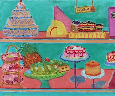
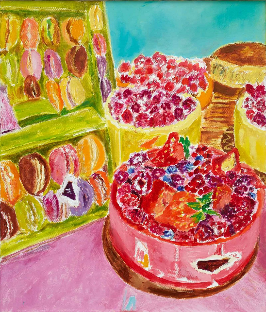
The fourth work submitted to the prize, Food Counter (2019), in turn, is a homage to Wayne Thiebaud, another artist whom Kamps frequently references (for example, see also pâtisserie, 2004; the six-piece commission Zucotto (now in a German corporate collection), 2005; and Macarons, 2019) and whose colours and subjects she loves.
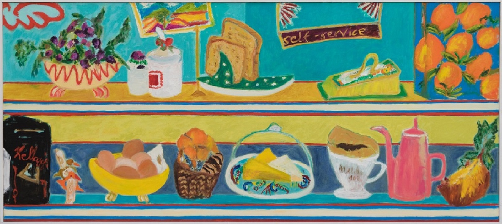
Unlike the other three works in this set, this painting is not a diptych in the traditional sense, nevertheless it is bisected horizontally into the two shelves of the restaurant counter. It is almost like watching a conveyor belt spool past, laden with motifs from Kamps’ visual vocabulary, or ‘working library’ – the objects breathe a sense of familiarity, both from our own lives and homes, but also from her other works. Like words in a sentence, the visual lexemes interact and combine to form new meanings in each work.
As Matisse advised his students, a still life should capture the ‘emotion of the ensemble, the interrelation of the objects, the specific character of each object – modified by its relation to the others’.(15) No object should ever be considered in isolation.
The edible items in this image outdo even Thiebaud in the luminescence of their pink, turquoise and yellow palette. Far too saccharine to be edible, they seem more like sugar confectionaries made solely for display, which, of course, these paintings also are – temptations, causing the viewer to desire some sweet delicacy to savour, but, in themselves, inedible. Bonnard once confessed: ‘Certainly colour had carried me away. I sacrificed form to it almost unconsciously.’(16) Kamps, however, doesn’t allow this happen. As her former tutor, Hermann-Josef Kuhna, notes in his 2005 essay: for Kamps, form establishes the pictorial space and colour elevates it.(17)
Let us now come back to where we began and look a little more closely at Behind the Screen. The title derives from the folding object that fills most of the left-hand canvas, a painting of an actual screen Kamps made – Paravent No. 3 – in 2004. This is where the homage to Matisse most blatantly resides, but it might be noted, also, that two of Bonnard’s earliest works influence by Japonisme include the four-panel, lithographic-print screen, The Nurses’ Promenade (1894-97), and another screen, Women in the Garden (1890-91).
The right-hand canvas, created first, was painted during a stay in Paris and liberally depicts Kamps’ apartment during this time. I say ‘liberally’, for the palette is imbued with a southern glow; the sofa is that from her home in Düsseldorf; and the cats Seraphine and Carry, whom she was understandably missing, have been brought to play (or rather snooze) in their favourite comfy corner. Here, too, the two canvases, at first glance, line up, but look more closely and there is a certain mismatch between the floorboards – and then you notice the shadow figure, creeping from right to left. Described in the brochure as having been added ‘on a whim’, Kamps confirms that this really was the case. The painting is otherwise very homely and welcoming, but the figure casts – quite literally – an uncanny shadow over it. There is something about her being in the centre, just into the left-hand canvas, thereby perhaps representative of the past – that which has gone and is no longer? Look more closely at Bonnard’s seemingly joyful The Studio with Mimosa and you will see a shadow figure there too, in the bottom left-hand corner. In this case, it is most likely the memory of his wife Marthe, who died in 1942, four years before he completed the painting.
Who, then, is the figure in Kamps’ work? Is it her own shadow, longing for the seaside and summery joy of the image on the screen? Since Kamps often paints scenes depicting the studio, or with an easel, the implication is that the reflection of any character on the canvas should be the artist herself. Although, equally, it could be that of the viewer. Either way, there is something unsettling about her, causing us to enquire and dig deep into our own thoughts and psychologies, our own memories and our own desires. The left-hand panel appears to depict summer in the south of France; the right-hand one, from the flowers – tulips and hydrangea, which are starting to drop their petals (another hint at the implicit memento mori, the transience and passing of time), seems to be late spring in Paris. The shadow figure plays a role here in bridging the two spaces – two places, two seasons, two memories, two times.
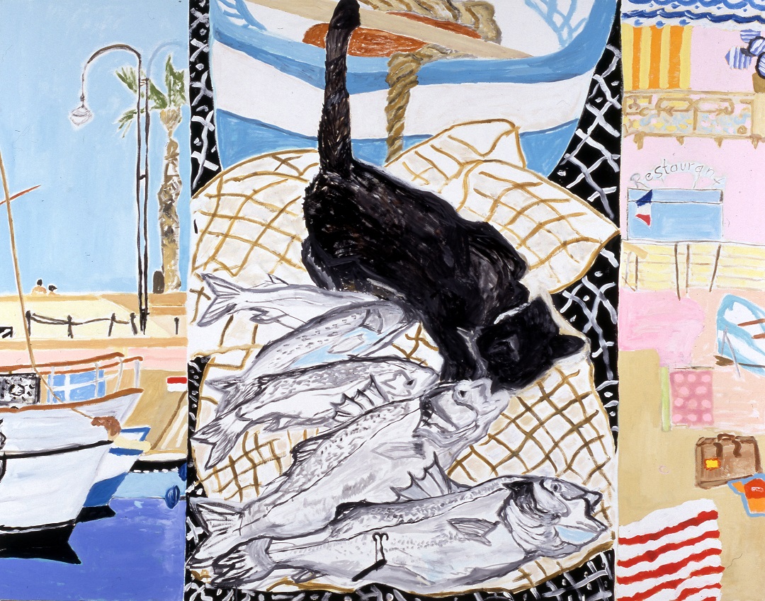
With reference to this notion of the relationship between the polyptych and the representation of different times, Kamps’ Hafen Cassis (2000) is exemplary. This time a triptych, it maps neatly on to past, present and future, with the calm harbour (past) to the left, the restaurant to the right (future), and the larger, central image depicting a cat setting upon the freshly caught fish (present), introducing a tension – as with the leaping cat in Comme Chez Nous – as to what will happen next and whether the catch will make it to the restaurant before being gobbled up by the greedy feline.
The previously-mentioned motif of the window is another device Kamps uses, alongside the different panels of her diptychs, and the collision of planes of flat colour and patterned surface, to suggest different temporalities. This is nowhere more apparent than in Behind the Screen, with its three full-length windows in the Parisian apartment, and a window within a window (and a screen within a screen) on the left-hand side. In A Theory of Contemporary Rhetoric, Richard Andrews describes the window thus: ‘This apparently simple building device […] defines the borderland or the frame between the interior and the exterior. Such abstraction enables us to think of the implications of that distinction: interiority/what is “other” or outside; what is familiar on the one hand, and what is less familiar on the other. […] The window itself is a membrane, a plane of transparency between the two worlds…’(18) Relating it specifically to the temporal, Lara Marlowe writes of Bonnard: ‘[He] used windows, doors and mirrors as composition devices. But they are also metaphysical, creating a constant flow between reality and reflection, between interior and exterior, the painter’s inner life and the world outside. […] Time is suspended.’(19) And Matisse himself wrote: ‘If I have managed to reunite in my painting what is outside, that is to say the sea, with the inside, it is because the atmosphere of the landscape and my room are one and the same… I don’t have to bring the outside and the inside together, the two are reunited in my emotion.’(20)
I believe the same is true for Kamps. Through the use of her various devices – the diptych, the different planes, the window motif, the captured moment of tension, the shadow figure – she brings together not just past and present, but also present and future. Perhaps, then, it is not so much as Eliot opens his Four Quartets, but as he closes it:
Time past and time future
What might have been and what has been
Point to one end, which is always present.
It is the present which holds both time past and time future, and the present moment which is always captured in Kamps’ painting – the artist’s present moment, even if imbued with strains of past and future (and even conditional ‘what if’s), but also the viewers’, affected, in whichever way it is, by their encounter with the work. The work, in this instance, is the only window: the window through which viewers looks on to the world, imaginary as it may be, in which they, for as long as they stand before the painting, exist.
St Paul's Walden Bury
Hertfortshire
England
May 2020
© Anna McNay, 2020
*Anna McNay is a freelance art writer and editor based in the United Kingdom. She completed an MA in History of Art at Birkbeck, University of London (2013). She served as Arts Editor for DIVA magazine (2012-2016), Deputy Editor of State media (2013-2017) and Assistant Editor at Arts Quarterly magazine (Art Fund, 2017-2020). She has considerable experience in writing catalogue essays, reviews and profiles for online and print publications, as well as conducting live interviews and speaking at events, galleries and art schools. She is a member of the United Kingdom chapter of the International Association of Art Critics (AICA). http://www.aicauk.org/our-members/user/257/ Click on Anna's link https://annamcnay.art/
NOTES
1 Christiane Dressler, “25 Degrees in Winter,” in Susanne Kamps. 25 Degrés en Hiver. Bilder 2005-2010, 2010, pp4-5, p4
2 Matisse described his collection of objects – and objets d’art – from around the world as his ‘working library’ to his daughter Marguerite Duthuit in 1943. Archives Henri Matisse, Issy-les-Moulineaux, cited in Ellen McBreen, “Matisse at Work”, in Matisse in the Studio, published by Museum of Fine Arts, Boston, to accompany the exhibition of the same name, 2017, pp13-42, p14
3 Other works by Kamps that pay homage to the style of Japonisme include (not exhaustively): Bambus Triptychon (1998), Japanese Breakfast (2006), Japanese Lady Playing the Samisen (2006), Asia (2009), Veilleur de Nuit (2009) and After Van Gogh (2015).
4 Belinda Thomson, “Vuillard’s Poetry of the Everyday: Questions of Intimism and Taste,” in Edouard Vuillard: The Poetry of the Everyday, published by The Holburne Museum, Bath, to accompany the exhibition of the same name, 24 May – 15 September 2019, pp9-27, p25
5 Chris Stephens, “Foreword,” in Edouard Vuillard: The Poetry of the Everyday, published by The Holburne Museum, Bath, to accompany the exhibition of the same name, 24 May – 15 September 2019, pp5-7, p6
6 Personal correspondence
7 Chris Stephens, “Foreword,” in Edouard Vuillard: The Poetry of the Everyday, published by The Holburne Museum, Bath, to accompany the exhibition of the same name, 24 May – 15 September 2019, pp5-7, p5
8 Note by Vuillard, 26 October 1894, cited in Belinda Thomson, “Vuillard’s Poetry of the Everyday: Questions of Intimism and Taste,” in Edouard Vuillard: The Poetry of the Everyday, published by The Holburne Museum, Bath, to accompany the exhibition of the same name, 24 May – 15 September 2019, pp9-27, p10
9 Belinda Thomson, “Vuillard’s Poetry of the Everyday: Questions of Intimism and Taste,” in Edouard Vuillard: The Poetry of the Everyday, published by The Holburne Museum, Bath, to accompany the exhibition of the same name, 24 May – 15 September 2019, pp9-27, p26
10 Belinda Thomson, “Vuillard’s Poetry of the Everyday: Questions of Intimism and Taste,” in Edouard Vuillard: The Poetry of the Everyday, published by The Holburne Museum, Bath, to accompany the exhibition of the same name, 24 May – 15 September 2019, pp9-27, pp17-18
11 Belinda Thomson, “Vuillard’s Poetry of the Everyday: Questions of Intimism and Taste,” in Edouard Vuillard: The Poetry of the Everyday, published by The Holburne Museum, Bath, to accompany the exhibition of the same name, 24 May – 15 September 2019, pp9-27, p27
12 Lara Marlowe, “Pierre Bonnard: The bright palette of a tortured soul,” The Irish Times, 23 April 2019 https://www.irishtimes.com/culture/art-and-design/visual-art/pierre-bonnard-the-bright-palette-of-a-tortured-soul-1.3858758 [accessed 13 May 2020]
13 Matthew Gale, “Pierre Bonnard: Suspended in Mid-Air,” in The CC Land Exhibition. Pierre Bonnard: The Colour of Memory published by Tate Publishing, London, to accompany the exhibition of the same name, 2019, pp10-24, p11
14 Susanne Kamps: Tea Time, Cynthia Corbett Gallery, March 2020
15 “Sarah Stein’s Notes, 1908,” in Jack Flam, Matisse on Art, rev. ed. Berkeley: University of California Press, 1995, p51, cited in Ellen McBreen, “Matisse at Work”, in Matisse in the Studio, published by Museum of Fine Arts, Boston, to accompany the exhibition of the same name, 2017, pp13-42, p18
16 Charles Terrasse, Bonnard, 1927, pp128-29: ‘Certes, la couleur m’avait entraîné. Je lui sacrifiais, et presque inconsciemment, la forme…’, cited in Matthew Gale, “Pierre Bonnard: Suspended in Mid-Air,” in The CC Land Exhibition. Pierre Bonnard: The Colour of Memory published by Tate Publishing, London, to accompany the exhibition of the same name, 2019, pp10-24, p12
17 Hermann-Josef Kuhna, “Starke Farben”, in Susanne Kamps. Bilder 1996-2005, 2005, pp8-9, p8
18 Richard Andrews, A Theory of Contemporary Rhetoric, Routledge: New York, 2014, pp91-92
19 Lara Marlowe, “Pierre Bonnard: The bright palette of a tortured soul,” The Irish Times, 23 April 2019 https://www.irishtimes.com/culture/art-and-design/visual-art/pierre-bonnard-the-bright-palette-of-a-tortured-soul-1.3858758 [accessed 13 May 2020]
20 Matisse in a letter to Teriadeune, cited in Richard Andrews, A Theory of Contemporary Rhetoric, Routledge: New York, 2014, pp91-92, p93